

Margin: Our New Design Standards
We are releasing Margin, an open source visual system designed for web apps with high information density and users who need to move fast.
In designing Margin, we are unifying our many existing web apps with simple, reusable, and consistent design standards. We decided to implement Margin as a layer over bootstrap because it is easy for people with varying degrees of CSS experience to use, and many of our web apps are built with bootstrap already. Margin has all of the same class names that bootstrap uses, and it also includes custom typography and typographic elements, secondary and accent colors, borders, shadows, margins, padding, cards, holy grail layout support, a flexbox grid, and Belvedere’s login styles. It is compiled into a single margin.css file, or margin.min.css, for easily dropping into your project.
Designing a visual system to accommodate both trading software and internal tools presents several unique challenges. Our first priority was developing something that would allow users to be able to process large amounts of information quickly. Our design also needs to be both reconfigurable and easy to apply. Additionally, it needs to be able to accommodate the different amounts of information density on screen in our web apps. Our singular design standards have to account for an app that might have many information design-heavy views constrained within the parameters of the window, an app that primarily displays tabular data, and everything in between.
This means that we have made a few design decisions that make Margin different. Two examples of how we approach these challenges are our typographic strategy and our reconfigurable layout and grid system. Let’s take a look at the case studies, below:
CASE STUDY: TYPOGRAPHY
We began by examining existing research into which typeface people processed the most quickly. One of the more well-known studies in this area, which we took some of our cues from, was ‘Fortune Favors the Bold (and the Italicized): Effects of disfluency on educational outcomes’. The authors found that study participants processed information slowly and thoroughly with unfamiliar typefaces, and in many ways, our users need to do just the opposite: take in information at a glance.
With a newly discovered preference for familiar typefaces in mind, we then looked to existing design precedents related to speed. One fantastic example is the usage of the typeface DIN on many highways in Europe.

An example of DIN on a highway sign
Originally designed for the German railway system in 1905, DIN was adopted by the German Institute of Standardization in the 1930’s and rapidly gained ubiquity. We also looked at Font Bureau’s Interstate, which is used on highways in America. After all, when you’re blitzing down the highway at warp speed, you need to process information on signage efficiently.
Given our intent to open source Margin, we had a strong preference for open source typefaces developed specifically for screen use. This led us to finally choose Roboto, which has many visual characteristics in common with the original DIN. It’s also everywhere— at the time of writing, its page on Google noted that the Google Fonts API had served it up 33.3 billion times over the last week.

Roboto type specimen
Choosing such a ubiquitous typeface is, in some ways, an unconventional move; often when you’re selecting a typeface to represent a brand, you look for something highly unique. We know that Roboto isn’t ever singularly going to be associated with Belvedere Trading, but we also know that its popularity is potentially a huge asset. And that is why you’ll see it as the primary typeface across our web products.
CASE STUDY: LAYOUT AND GRID
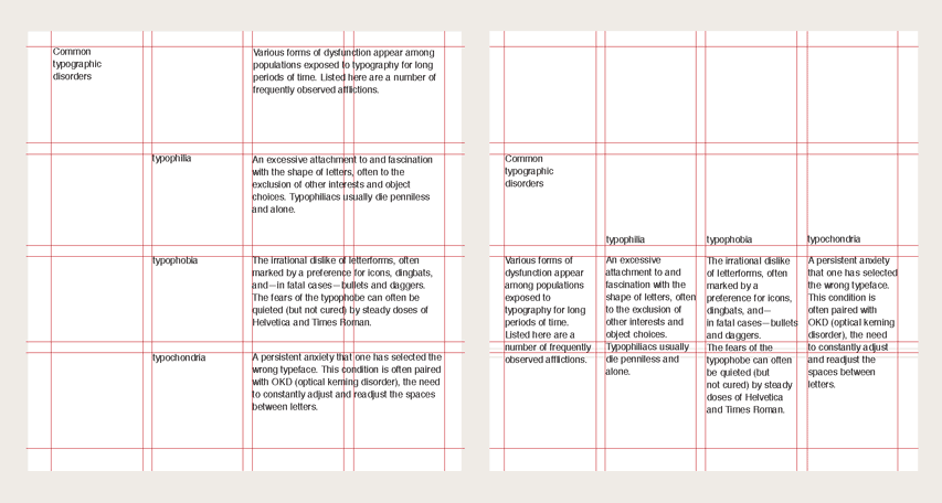
Our users need to see as much information as possible at a glance, but that information still needs to be legible. When our users need to gain insights from data visualization quickly, scrolling through a page to find a specific chart with a specific data point is too time consuming. Typically, a designer can solve the problem of information overload by being judicious with what features and visualizations they choose to surface, making use of traditional approaches to visual hierarchy. For our simpler apps, we include holy grail support to accommodate that approach.

A preview of our styleguide and holy grail layout support
However, in the case of many of our web apps, the traditional concept of what information lives ‘above the fold’ is flipped on its head. Our more information-dense apps might use browser technology, but from a UI perspective, they don’t look or feel like what one might typically find in a browser. In many cases, this has meant that we have had to re-examine the traditional grid, which has its roots in print design. The modern, screen-based incarnation of a traditional grid system is, of course, often invaluable when implementing responsive design, so we do still have support for bootstrap’s column grid (Margin is a layer over bootstrap, after all). That said, our needs differ in that many of our apps are designed solely for desktop use. A grid with its roots in static print on a page might not always be well suited to a dynamic application, and it especially doesn’t always fit an environment where the user might be configuring some of the layout themselves.
A typical typographic grid, which was originally developed for print layouts. These grids were later modified to accommodate design for the web (courtesy of 'Thinking with Type')
This has led us to develop an additional, highly un-opinionated, flexible grid system meant for desktop apps with views where the user has some control over the layout, or the information displayed is constrained within the confines of the window. Grids don’t need to be one size fits all.
Using our grid will feel more like using flexbox than a typographic grid, and that’s by design. Whereas a typical grid layout is deliberately rigid, cells in our new grid system grow vertically and horizontally. Our additional margin and padding classes serve as gutters and provide structural support and visual regularity. When pairing these margin/padding classes with the specific flexbox features we choose to expose, we now have a DOM tree-dictated grid. Our new grid allows us to think about our views and prioritize what information we display in terms of the space available in the window at any given time. What this means for our user is that they don’t have to spend time rooting around for crucial information; it’s displayed predictably.
A visual designer will readily tell you that design is just as integral to the functionality of a product as its features. Anyone who’s experienced the delight of using a cohesive user interface (or, frankly, the frustration of an unconsidered one) understands that software is at its most invaluable when it is intuitive to use. Software is built by and for humans (at least, for now), and that’s why we’re focusing on building software with people in mind.